Download a Pivot Table Practice File designed by Wael Abed, Excel Modeling Expert.
Introduction: Why Pivot Tables are Excel’s Game-Changing Feature
Whether you’re looking to analyze sales data or create financial reports, mastering Excel Pivot Tables is essential for anyone working with data in spreadsheets .If you’ve ever felt overwhelmed by thousands of rows of data in Excel, staring at a screen full of numbers that don’t make sense, you’re not alone. Manually sorting, filtering, and subtotaling data is not only time-consuming but also prone to error. This is where Excel Pivot Tables come in.
A Pivot Table is one of the most powerful and underutilized tools in Microsoft Excel. It allows you to extract significance from a large, detailed dataset by summarizing it into a meaningful, interactive report. Think of it as a magic wand that transforms your raw data into actionable insights with just a few clicks.
In this ultimate guide, we will walk you through everything you need to know—from creating your very first Pivot Table to building advanced financial and sales dashboards. We’ll even provide you with ready-to-use examples to kickstart your analysis.
What You’ll Learn:
- The Fundamentals: What a Pivot Table is and its core components.
- A Step-by-Step Tutorial: How to create your first Pivot Table from scratch.
- Sales Report Example: Analyze sales performance by region, product, and salesperson.
- Financial Analysis Example: Summarize income statements and track key metrics.
- Pro Tips & Tricks: Advanced techniques to make your Pivot Tables even more powerful.
H2: Master Excel Pivot Tables for Data Analysis
Simply put, a Pivot Table is a reporting tool that summarizes and aggregates data. It enables you to « pivot » or rotate your data, looking at it from different perspectives without altering the original dataset.
H3: How to Create Your First Excel Pivot Table
To understand Pivot Tables, you need to be familiar with their four main areas:
- Filters: This allows you to apply a filter to the entire report. For example, you could filter to show data for only a specific year or a single product category.
- Columns: The labels you place here will form the columns of your Pivot Table. This is often used for time periods (Months, Quarters) or categories you want to display horizontally.
- Rows: The labels you place here will form the rows of your Pivot Table. This is typically where you put your main categories, such as Product Names, Regions, or Salespeople.
- Values: This is the heart of the Pivot Table. Here, you place the numerical data you want to summarize—like Sales Amount, Units Sold, or Profit. By default, Pivot Tables will SUM these values, but you can easily change the calculation to AVERAGE, COUNT, MIN, MAX, and more.
Internal Link: Ready to convert numbers into words? Learn how to use the Number to Words function in Excel to transform numeric data into readable text for your Pivot Table reports.
H2: How to Create a Pivot Table: A Step-by-Step Tutorial for Beginners
After creating your first Pivot Table in Excel, you’ll be able to quickly summarize and analyze large datasets with ease .Creating a Pivot Table is surprisingly simple. Let’s walk through the process with a basic example.
H3: Step 1: Prepare Your Data Source
The most critical step happens before you create the Pivot Table. Your data must be well-structured:
- Organize data in a tabular format. Use a single row for headers.
- No blank rows or columns within your data set.
- Each column should represent a unique category (e.g., Date, Product, Region, Sales).
- Ensure all data in a column is of the same type (e.g., don’t mix text and numbers).
Example of Good Data:
| Order ID | Date | Region | Salesperson | Product | Units Sold | Revenue |
|---|---|---|---|---|---|---|
| 1001 | 1/15/2024 | North | Jane Doe | Widget A | 5 | $500 |
| 1002 | 1/16/2024 | South | John Smith | Widget B | 3 | $450 |
H3: Step 2: Insert Your Pivot Table
- Click on any single cell within your dataset.
- Go to the Insert tab on the Excel ribbon.
- Click the PivotTable button.
- A dialog box will appear. Excel will automatically select your data. Choose to place the Pivot Table in a New Worksheet and click OK.

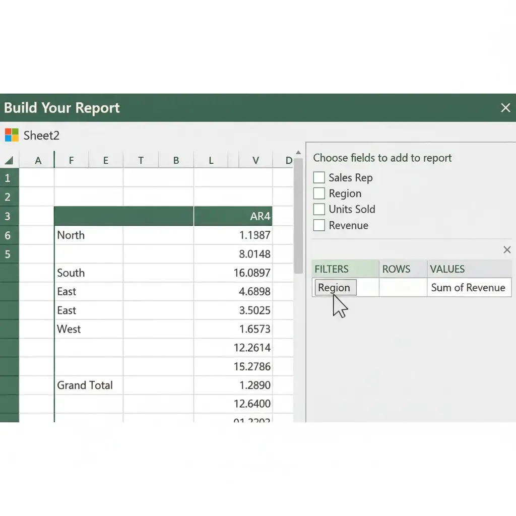
H3: Step 3: Build Your Report
Excel will open a new sheet with the Pivot Table framework and the PivotTable Fields pane. This is where you build your report.
- Let’s say you want to see Total Revenue by Region.
- Drag the « Region » field to the ROWS area.
- Drag the « Revenue » field to the VALUES area.
That’s it! You now have a summary table showing the total sales for each region. You’ve just created your first Pivot Table.
External Link: For a visual guide, Microsoft’s official support page on Overview of PivotTables and PivotCharts is an excellent resource.
H2: Pivot Table Example 1: Dynamic Sales Performance Report
Let’s get practical. Imagine you are a Sales Manager and you receive a raw data export of all transactions for the quarter. Your goal is to create a dynamic report that answers key business questions.
[Link to Downloadable File: sales_data_pivot_template.xlsx]
H3: The Raw Sales Data
Our sample dataset contains over 500 rows with the following columns: Date, Month, Quarter, Salesperson, Region, Product Category, Product, Units Sold, Unit Price, Total Revenue.
H3: Business Question 1: What is the Total Revenue by Region and Product Category?
This is a classic two-dimensional analysis.
- ROWS: Drag the
Regionfield. - COLUMNS: Drag the
Product Categoryfield. - VALUES: Drag the
Total Revenuefield.
You now have a clear matrix showing which product category performs best in each region. You can instantly see if the « North » region is strong in « Widget A » but weak in « Gadget B. »
H3: Business Question 2: Who are my top-performing salespeople by quarter?
Let’s analyze performance over time.
- FILTERS: Drag the
Salespersonfield (you can use this to focus on individuals later). - COLUMNS: Drag the
Quarterfield. - ROWS: Drag the
Salespersonfield. - VALUES: Drag the
Total Revenuefield.
To identify top performers, simply sort the table descending by right-clicking on the Grand Total column and selecting Sort > Largest to Smallest.
H3: Enhancing the Sales Report with Slicers and Timelines
Static tables are good; interactive dashboards are better.
- Inserting a Slicer: Go to PivotTable Analyze > Insert Slicer. Choose
RegionandProduct Category. Now, with a single click, you can filter your entire report to show only « North » region and « Widget A » products. - Inserting a Timeline: If your data has dates, go to PivotTable Analyze > Insert Timeline. Select your
Datefield. You now have a beautiful, visual slider to filter your report by days, months, quarters, or years.
Pro Tip: Use the % of Grand Total calculation. Right-click a value in your Pivot Table, select Show Values As > % of Grand Total. This instantly shows you that, for example, the « South » region contributes 45% of all revenue.
H2: Excel Pivot Table Examples: Sales and Financial Reports
Financial professionals rely on Excel Pivot Tables to create dynamic income statements and balance sheet reports. For financial analysts, Pivot Tables are indispensable for quickly summarizing trial balances, expense reports, and income statement details.
Link to Downloadable File: financial_analysis_pivot_template.xlsx
H3: The Raw Financial Data
Our sample dataset is a detailed transaction log with columns: Date, Account ID, Account Name, Account Type (Revenue, COGS, Expense, etc.), Department, Amount.
H3: Business Question 1: Can I create a summarized Income Statement?
Absolutely. This is where grouping comes in handy.
- ROWS: Drag the
Account Namefield. - VALUES: Drag the
Amountfield. - Now, manually group the accounts to form the structure of an income statement:
- Select all Revenue accounts, right-click, and choose Group.
- Rename the group « Total Revenue. »
- Do the same for « Cost of Goods Sold » and « Operating Expenses. »
You now have a dynamic, collapsible income statement. You can drill down into the details of « Operating Expenses » or collapse it to see the high-level profit.
H3: Business Question 2: How are expenses distributed across departments?
This helps with cost center analysis.
- FILTERS: Drag the
Account Typefield and filter for « Expense ». - ROWS: Drag the
Departmentfield. - COLUMNS: Drag the
Account Namefield (for major expense categories). - VALUES: Drag the
Amountfield.
This matrix shows you exactly how much the « Marketing » department spends on « Salaries » vs. « Software, » allowing for powerful budget versus actual comparisons.
H3: Advanced Financial Metric: Year-over-Year (YoY) Growth
To calculate growth, you need a time component.
- Build a Pivot Table with
Datein the ROWS (grouped by Years and Quarters) andAmountin the VALUES (filtered for Revenue accounts). - Right-click on a value in the
Amountcolumn. - Go to Show Values As > % Difference From.
- In the dialog box, for Base Field, choose
Yearsand for Base Item, choose (previous).
Your Pivot Table will now show the revenue for each quarter alongside the percentage growth compared to the same quarter in the previous year—a critical metric for any financial review.
Internal Link: Take your financial models to the next level by mastering the INDEX-MATCH formula in Excel, a powerful alternative to VLOOKUP.
H2: Advanced Pivot Table Tips and Tricks to Impress Your Boss
You’ve mastered the basics. Now, let’s unlock the true power of Pivot Tables.
H3: 1. Using the Data Model for « Distinct Count »
A common headache is counting unique values. How many unique customers placed orders? The standard Pivot Table only does a total count.
Solution: The Data Model.
- When creating your Pivot Table, check the box that says « Add this data to the Data Model. »
- When you add your field (e.g.,
Customer ID) to the VALUES area, right-click it. - Go to Value Field Settings.
- Scroll down and select Distinct Count.
H3: 2. Grouping Dates and Numbers
- Group Dates: Right-click on a date in your Pivot Table and select Group. You can group by Seconds, Months, Quarters, and Years simultaneously. This is perfect for trend analysis.
- Group Numbers: To create age brackets or salary bands, right-click on a numeric field and select Group. You can set the starting, ending, and interval values.
H3: 3. Calculated Fields and Items
What if you need a metric that isn’t in your original data, like Profit Margin?
- Go to PivotTable Analyze > Calculations > Fields, Items, & Sets > Calculated Field.
- Name it « Profit Margin. »
- In the formula box, enter:
= (Revenue - COGS) / Revenue. - Format the result as a percentage.
You’ve just added a brand new, calculated metric to your Pivot Table that updates as you pivot.
H3: 4. Preventing Common Pivot Table Problems
- Data Not Refreshing: Remember, Pivot Tables don’t automatically update when your source data changes. You must right-click and select Refresh.
- « GetPivotData » Formula Error: This occurs if you type
=and then click on a Pivot Table cell. To turn it off, go to PivotTable Analyze > Options > uncheck « Generate GetPivotData ».
External Link: For a deep dive into advanced relationships and data modeling, the Microsoft Power Pivot documentation is the next logical step.
Internal Link :Struggling with error values in your source data? Learn how to clean them up beforehand in our guide on how to handle errors in Excel.
H2: Conclusion: Your Journey to Pivot Table Mastery
As you continue to work with Pivot Tables in Excel, remember that practice is key to mastering these powerful data analysis tools .Excel Pivot Tables are not just a feature; they are a fundamental skill for anyone who works with data. They bridge the gap between raw, chaotic data and clear, decision-driving information. From creating a simple summary to building an interactive financial dashboard, the ability to pivot your data is a superpower.
Recap of Your Journey:
- You learned the core components of a Pivot Table.
- You followed a step-by-step guide to create your first one.
- You built a dynamic Sales Performance Report.
- You constructed a Financial Statement Analysis.
- You explored advanced tips like distinct counts and calculated fields.
The best way to learn is by doing. Download our practice files, break the Pivot Tables, rebuild them, and experiment with the fields. Soon, you’ll be answering complex business questions in minutes that used to take hours.